Friday, 30 September 2011

Ideas for Poster

1st Poster Idea


This is another idea for the poster of our soap opera which I have constructed. The poster shows verisimilitude as it explains realistic storylines and uses a familiar location. The poster shows a split screen of good and evil with the tagline 'There's a fine line between love and hate'. This creates a juxtaposition for the audience and leads them to think about the possible storylines of the soap which attracts them to watch the soap opera.

Sunday, 25 September 2011

Trailer Titles

Soap Trailer Titles

Initial Ideas on Our Own Soap


I created a mind map of initial ideas for our own soap in which I looked at the type of charcters and their personalities, any possible settings and locations which could be used, storylines and how they develop and the content of the soap opera trailer. In dark blue lettering dotted around the page, I brainstormed some ideas of the title of our soap opera which fit in with a glamour theme.

LOCATION/SETTING


To adapt my intial ideas on the possible locations and settings of my own soap opera, I am going to look at generic conventions of soap opera locations and analyse existing soaps with relation to location.
Soaps tend to have a strong regional identity in which it is well known from - Eastenders is set in the East of London and Coronation Street is set in Manchester. This enables audiences to identify soaps with location and also makes the soap realistic and believable. When it comes to choosing a location for my soap, i will consider this and make sure that where i choose to film is a familiar area in which the audience can relate to and therefore associate the soap and attract a wide range of people.
Most locations in soap operas are domestic & interior settings with some exterior settings such as streets and the square in Eastenders. Pubs and Shops are main locations used along with kitchens and living rooms (interior) within the house.
Using these would follow generic conventions of a soap.

Pubs
'The hub of the community'
In soap operas, pubs are the central location where characters meet and many events take place. Soaps are generally known for their pub such as the 'Queen Vic' in Eastenders and 'Rovers Return' in Coronation Street. Pubs are conventional locations in soaps and for this reason, I think a good idea would be to base our soap trailer primarily in a pub location which would also give the oppurtunity to introduce multiple characters.
Cafe's & Corner 

Soap operas usually have a cafe and a selection of other small shops and businesses. Most of these locations are featured in each episode of the soap and they are seen as conventional locations. Characters own and run the cafes and shops and are normally related to certain characters and families, for example Kathy's Cafe in Eastenders owned by the Beale's. Many of the charcters get together in these places, however, not as popular as the pub, cafe's tend to invite the younger generation.

With the theme of our soap being young and glamourous, a central, upmarket cafe would be an ideal location for the trailer to be set as it can connote unity and give a sense of youthfulness.

Another main location would be character housing. Soap operas are based around a small community of many older style terraced properties. Introducing multiple characters in houses would be difficult, but we could base the trailer around a party which would mean the characters would all get together to celebrate the new soap opera.

CONTENT OF TRAILER


STORYLINES

I have looked into possible storylines that could be included within my own soap opera episodes which will be highlighted in the trailer (content of the trailer) to the audience. I have listed conventional storylines of a soap opera and i have also created a small flow chart to show how the opening of the first episode could run and how these storylines could be incorporated into our trailer.
Flow Chart


CHARACTERS


For further research into characters I have looked at conventional characters in existing soap opras and given a brief description on the type or character and their role in the soap.

I have looked at the stereotypical characters of pregnant teenagers and grandparent figures and researched into individual characters of different soaps.
Looking at these conventions we have decided to use a pregnant teenager in our piece as our target audience is of the younger generation they will be able to relate to this conventional character as this also creates verisimilitude to a real life situation.

Other conventional characters are:
Badboy such as Sean Slater, Eastenders
Businessman such as Dev in Coronation Street
Young Couple such as Andrew and Summer in Neighbours
Homosexual such as Christian in Eastenders
Boss Figure could be Phil Mitchell, Eastenders
Feisty Young Female and Jack-the-lad could be Kat & Alfie Moon, Eastenders
Children - Simon in Coronation Street and Jacob  in Emmerdale

In our soap opera, we will be following these conventional characters and will be using a younger cast with a pregnant teenager, young couple and homosexual which also represents different social groups and this will target our audience and create a verisimilitude, an impression of reality.
Comparison of existing trailers
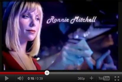
As we are creating a trailer for a new soap opera, we need to introduce new characters to the audience so they are able to understand the soap and the storyines linked to the characters. I thought that a good way of doing this was to use the characters names within the piece next to each character as they appear in the trailer so the audience are given a clear idea of who the characters are. An example of this in similar real media texts is the trailer for Roxy and Ronnie Mitchells arrival in Eastenders.


Soap Opera Magazine Analysis

I analysed two existing magazine listings covers in order to gain research into the generic conventions of a magazine cover and what makes them successful so I could apply this knowledge when it came to creating my own magazine cover for my own soap opera.

Soap Opera Magazine Analysis

Magazine Analysis 2

For my own soap opera, I would be looking to create a magazine cover special edition which would just feature our new soap.
Both magazine covers I have looked at and from previous knowledge, covers usually are very bright and busy so they are able to stand out on the shop shelves.
The magazine covers are similar with the use of bright headings to make the magazine cover eye-catching to the audience so I would make sure I used plenty of bright colours in this same way on my own cover.
The main cover line questions the audience and leaves them with something to think about which I will be looking to do with my magazine cover as this would make individuals buy the magazine to give clues to the answer.
Also magazines tned to have the key aspects situated in the left third of the magazine as this is the part of the magzine shown on the shop shelves.
Character emotion always reflects the storylines so I would make sure that the storylines are portrayed through the emotions and use of close up shots on the magazine cover. This research has shown me the conventions which are used to create a successul magazine cover so I will be able to follow these and challenge some.

Soap Opera Magazine/Listings Magazine Titles

I have looked at existing magazine listings covers in order to see how colours, images. layout and font help to promote and advertise a soap opera. From looking briefly at these, I will be able to apply this when it comes to creating my own listings cover.

  • Bright colours (orange, red, yellow, blue) - Clashing to stand out to the target audience.
  • Big, bold lettering with heavy black outlines to emphasise major storylines
  • In the top right hand corner there is a banner 'first for big soap news'. This draws the attention of the audience as it tells them they will be ;the first' to find out about the storylines and characters.
  • Harsh and Eccentric words are emphasised such as 'die', 'engaged' and 'pregnant'.
  • Headings are eye-catching with the use of a large font size and bright colours.


  • 'Bigger & Better' and '38p' (price advertised twice) - grabs attention - boost sales because it is cheap.
  • One main image (Max Branning) is used on the cover. He is outlined in white which contrasts with the black and blue colours and stands out.
  • Bright, bold headings are used.
  • Shows storylines from many different soaps to attract the majority of people.
  • 'Who wants max dead?' questions the audience making them want to buy the magazine to find out more.


From this research I have found how magazines attract the target audience and concluded that the bright colours and bold lettering make the magazine stand out to viewers. When it comes to creating my magazine cover I will make sure that my magazine stands out and that all white space is filled as magazine covers are generally very full.
Magazines usually have a left third which inclues the title, price and date of issue. The left third is what people see on the shelf so I will make sure that my magazine includes all the relevant information in the left third.
I have found that magazines tend to have one main coverline and focus on one story and look at lots of different soap opera storylines. As our soap opera is new, the magazine could be a special edition dedicated to our soap and feautre many different storylines from our soap focusing on the introduction of the new characters.

Soap Opera Poster Analysis

I have found two soap opera posters and have analysed them. I have done this to look at the conventions of soap opera posters and this will help me when I construct my own poster for my own soap as I will be able to refer to this research and include key aspects of a successful poster within my own work.
Soap Posters

From doing this research, I have found that soap opera posters must attract their target audience. Posters combine necessary information with images and text to create a successful poster to stand out to an audience and make them want to watch the soap that is being advertised.
The two posters I looked at were very different from one another. The first used bright colours and glamour to attract their audience which was teenagers and young adults, connoting fun and excitement whilst the Hollyoaks poster used darker colours to give connotations of danger to portray the upcoming storylines. Taglines on both posters were in keeping with the image. When it comes to planning my poster, I will need to make sure that my target audience are considered and look at making the poster suitable for the storylines and plot of the soap opera so the audience can relate to it.
Both posters gave information of when to watch the soap so this must be included in my own poster otherwise the audience would not know when they were able to watch the soap.
I think that I could look at more creative ways of showing the time, date and channel of the soap for my poster to challenge these conventions.

Soap Opera Poster


This soap opera poster was found on one of the billboards at an underground train station.
  • The fire effects highlight a specific storyline (a fire break out) and can give connotations of death.
  • The picture also gives an idea to the audience of who is involved in the fire and would question them on who will take injury and possibly die. This makes people want to watch the soap and find out.
  • The poster uses a tagline 'A week that will change Hollyoaks forever'. This immediately grabs the attention of the public and makes you want to find out how.
  • The tagline and viewing time is also on a white banner which connotes innocence and purity juxtapostioning the flames of the fire and standing out so it is clear for people to see.
  • The font is simple and easy to read.
  • Use of the channel 4 logo to easily identify the channel of the soap for any interest taken to the poster.
  • The main focus of the poster is the fiery characters which automatically draws attention to the poster and the colours are bright to stand out on the black background.


This poster was found in a magazine showing the 25th anniversary of Eastenders. It is primarily aimed at the audience of the magazine.
  • The poster is set in the Queen Vic which is the prime location of Eastenders.
  • All the characters are featured in the poster and all appear to be smiling and happy with the exception of a few which would mean that anyone that saw the poster would want to find out about the characters storylines.
  • The colours are bright to attract the attention of people reading the magazine. 
  • The River Thames which is shown in the introductory music/theme tune of the soap is portrayed through the use of ribbon on the poster which connotes a special event in Eastenders (25th anniversary) attracting audiences to watch the special upcoming episodes.
  • The characters highlight individual storylines and this makes people want to watch the soap to find out what happens.  

From carrying out research into existing soap opera posters, I have gained an insight into what they include and how they attract their target audience and I will be able to apply this knowledge when I come to making my own soap opera poster.
I have found that posters generally focus on one storyline that takes a big impact on the soap opera which makes the audience want to find out what happens (increasing viewing figures) so I will make my poster in a similar, effective way to introduce a new soap and attract the target audience.
I found that posters are fairly simplistic including a main image, tagline and viewing information (channel and time of soap). This is useful information for the audience which I will need to include in my poster.
We expect to include a picture of the main characters with a catchy tagline and a simplistic design which mirrors those of existing posters.